08 May 2014
I recently did some experimenting with animating inline SVG icons and wanted to quickly review my process and the joys and frustrations I ran into.
This demo is for Chrome only for now. Click to animate.
See the Pen Animated Shopping Cart Icons by Joni Trythall (@jonitrythall) on CodePen.
The very first step is to create your vector art. I used Adobe Illustrator. When you are done you will want to select Object > Artboards > Fit to Artwork Bounds. This is going to make sure your artboard is snuggled up against your artwork. If you don’t do this all that extra space around your work will show up in the SVG output, affecting its size on the screen and its perceived point of origin.
Make sure you use as many compound paths as you can in an effort to make the XML code it is going to spit out as short and reasonable as possible. For the shopping icons (especially the cart) we will be animating a lot of individual parts, so the code is long and there is not too much we can do about it. However, there are SVG optimizer tools you can use to “clean up” your SVG code output a bit.
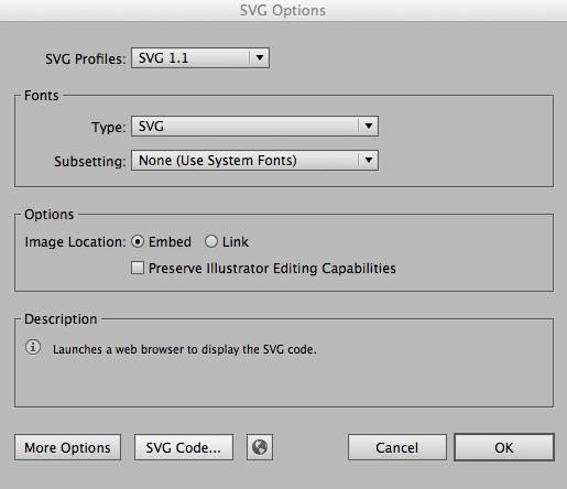
Once you are beyond happy with your artwork you will want to save it as an SVG. When you select .svg and click “save” an SVG Options box will pop up and this is where we will select “SVG Code…”

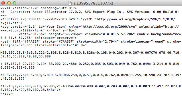
 We will want to copy that code and place it right in our HTML. At this point you can start trimming out the unnecessary code, like the DOCTYPE and Generator sections. Within this code you can also change details of your SVG, like the color of the stroke (border), and the fill (background).
Now we can go in and apply classes to the individual paths so we can select them in our CSS and animate them! Let’s focus on one simple icon, the second heart icon.
Here’s the SVG code:
<svg class="heart-icon heart-icon-2" version="1.1" width="91px" height="85px" viewBox="0 0 90.65 85.04">
<path class="heart-2" fill="none" stroke="#FFFFFF" stroke-width="5" stroke-linecap="round" stroke-linejoin="round" stroke-miterlimit="10" d="
M45.137,23.041c4.912-24.596,40.457-27.775,42.128-0.435c1.398,22.88-21.333,40.717-42.128,50.522 M45.137,23.041
C40.225-1.555,5.057-4.734,3.387,22.606c-1.398,22.88,20.955,40.717,41.75,50.522"/>
</svg>
Here’s the CSS:
.heart-2 {
  transform-origin: bottom;
  transition: stroke 1s 1s ease;
}

.active .heart-2 {
  animation: heart-beat 1s forwards;
  stroke: #ec6d46;
}

@keyframes heart-beat {
  25% {
    transform: scale(.3);
  }
  50% {
    transform: scale(1);
  }
  75% {
    transform: scale(.3);
  }
  100% {
    transform: scale(1);
  }
}
We have declared the point of origin at the bottom, but it’s important to know that by default the point of origin for an SVG is (0, 0), so you may often find yourself declaring transform-origin: center;. Once we click the heart it will appear as if it’s “beating” and will scale down, up, down, up, and then the stroke color will transition.
The first thing you may realize about working with SVG is that it’s a little different than what you may be used to. For example, border and background is stroke and fill, and you will need to move the paths via translate and not “top” and “left” (not just within the @keyframes).
I originally had the stroke changing color within the @keyframes, but quickly realized that any stroke or fill change within @keyframes in -webkit- for elements in an anchor tag will render as solid black once clicked. The only way around this that I found was so wrap the SVG in a <div> and not an <a>, which is less than ideal, or having the color change trigger within the active state declaration and applying a transition to manipulate its timing to your liking. It’s a total browser bummer, but it’s not impossible to work around.
For the clicking events, you will want to wrap everything related to each icon in an anchor. For example, the first cart icon anchor includes the cart icon SVG and the separate apple image. As far as the details of setting up your targeted click events, I found this post over at CSS-TRICKS to be really handy.
So while my research for optimizing SVG as much as possible continues, this was the way I went about it for these particular icons.
Happy inline animating!