01 June 2015
For the last couple months I’ve been developing a kid’s web design tutorial series for Tuts+, Tuts+ Town. There are eleven tutorials total and a couple of them were published recently and will continue to throughout June.

The series walks kids through some foundational level pieces like how the web works and how to manage site files, which leads to actually building a site together with HTML and CSS. There are then several courses devoted to understanding basic web design concepts like typography, whitespace, and color.
While I completely adore this project, I had a lot of doubts before I got started. Prior to this series I had never quite designed for kids in this capacity. A couple years ago I wrote and illustrated two preschool level books, but walking 10-13 year olds through HTML and CSS? Where do I even begin? What’s already out there and what can I do differently to improve upon these?
After a bit of research I ran into what I would now consider essential resources for designing tutorials for kids and pre-teens. I figured I would share these, as well as some lessons learned, in a quick post for other people in a similar situation.
The first thing I felt was missing after reviewing a couple online tutorials for kids, aside from how few there are to begin with, were supportive visuals. There was a lot of content but no imagery to reinforce this content.
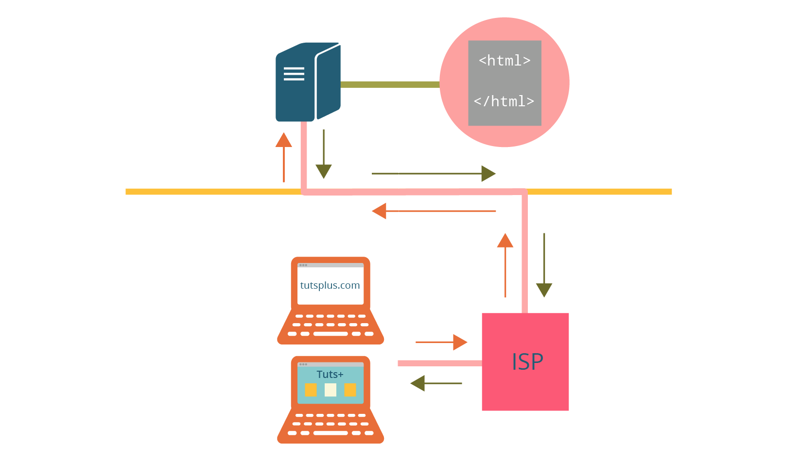
While visual support is important for learning in general, I feel that it’s especially crucial for younger learners. For example, following a writeup explaining how the web works without a diagram, in my opinion, is simply impossible even as an adult.
While the image below is a drastically simplified representation of how the web works, it hopefully provides Tuts+ Town readers with a general idea of what’s going on behind the scenes, demystifying the process a bit.
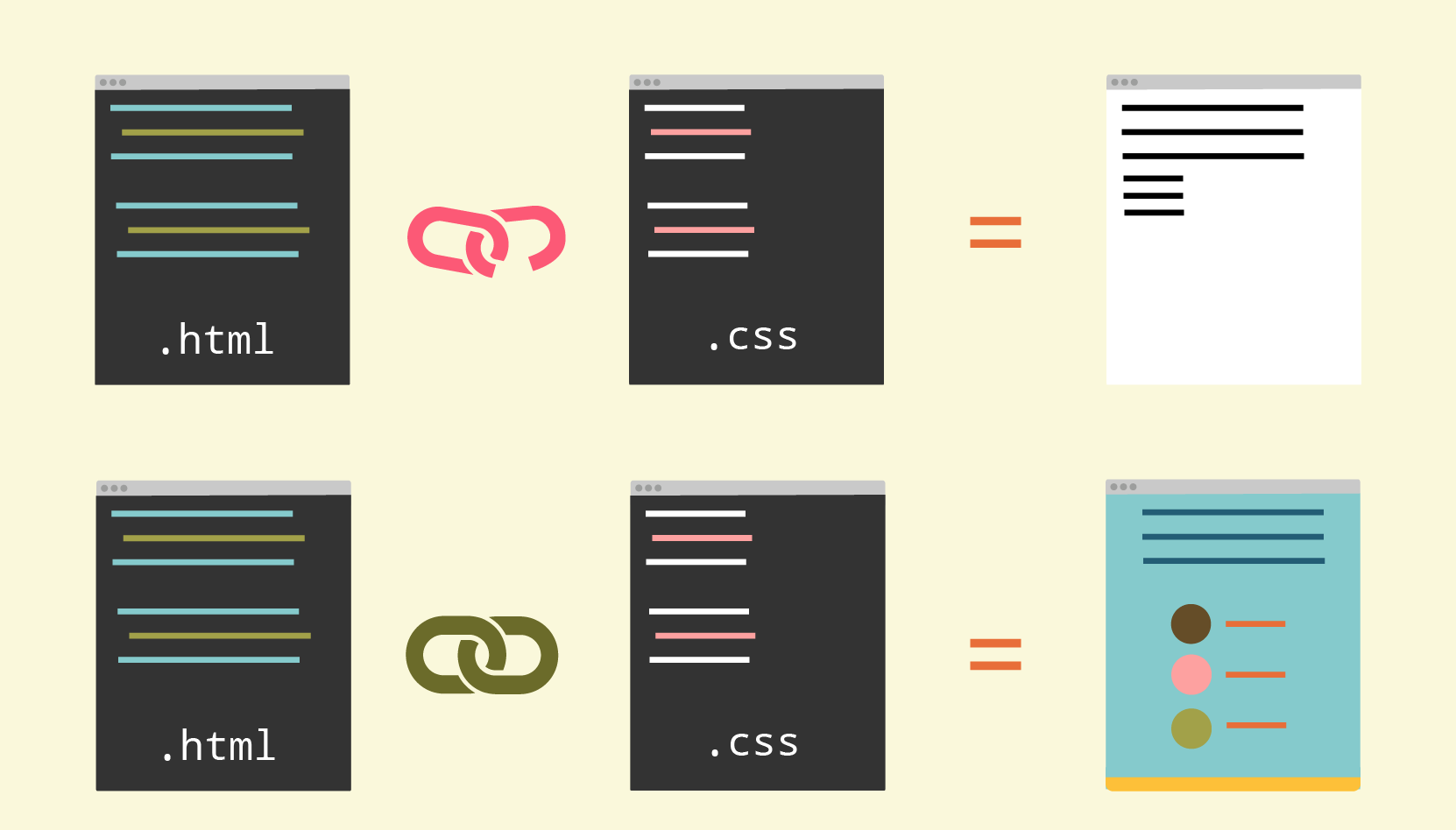
Even diagrams that depict what happens when a CSS document is incorrectly versus correctly linked in HTML can go a long way in representing and understanding overall concepts taking place.
While writing the Tuts+ Town series I tried to stay mindful of what things would lend well to visual representation and then brainstorm the most straightforward graphics to depict these concepts.
It was important to me to have a theme for this series to keep everything consistent and cohesive; plus it’s just more fun for everyone. Any tutorials I had come across with themes were much easier to follow and the connection between all facets of web design were much clearer.
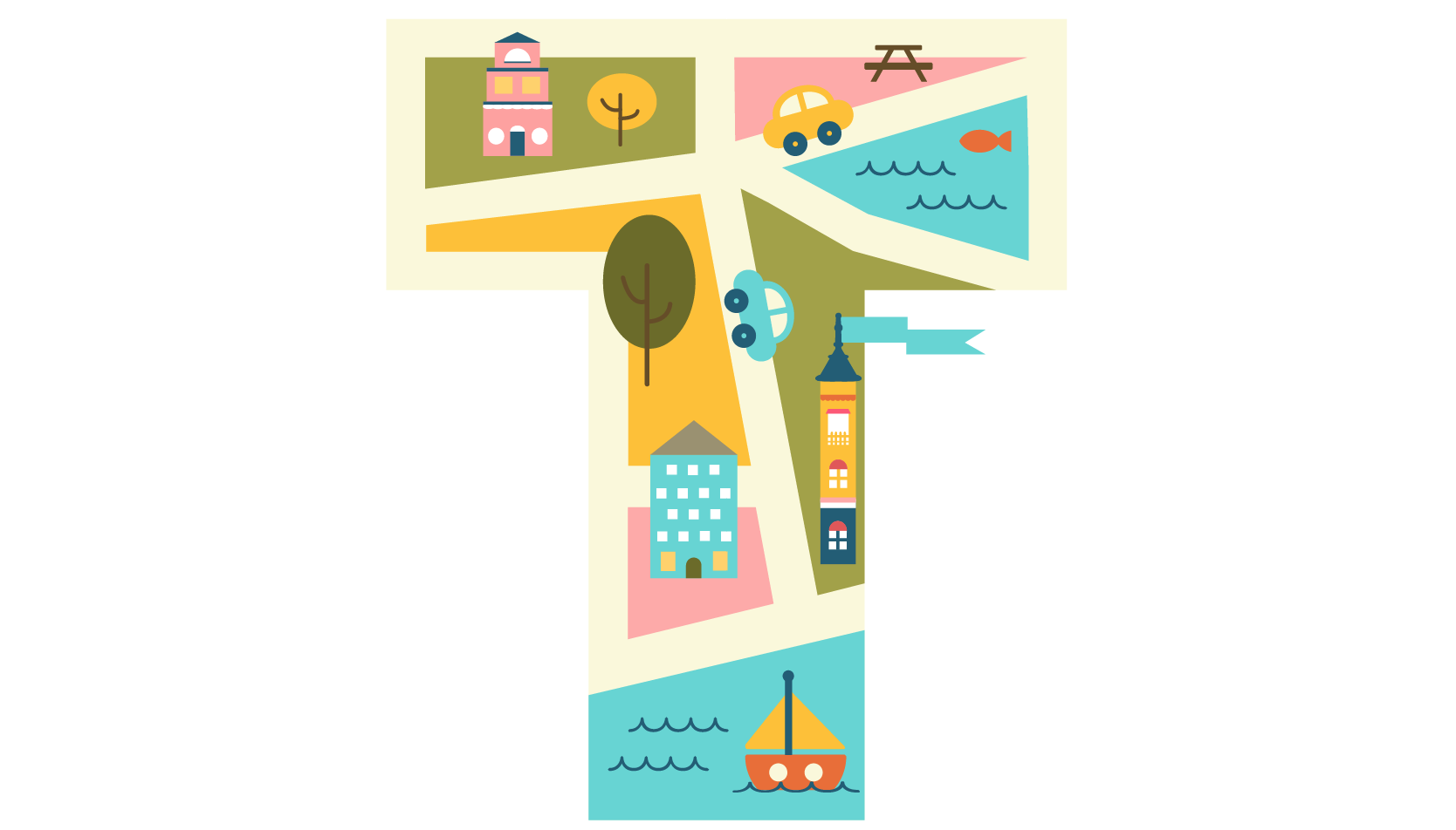
Having a fictional town theme allowed for different buildings to represent different parts of web design and lends well to especially neat images, like maps.
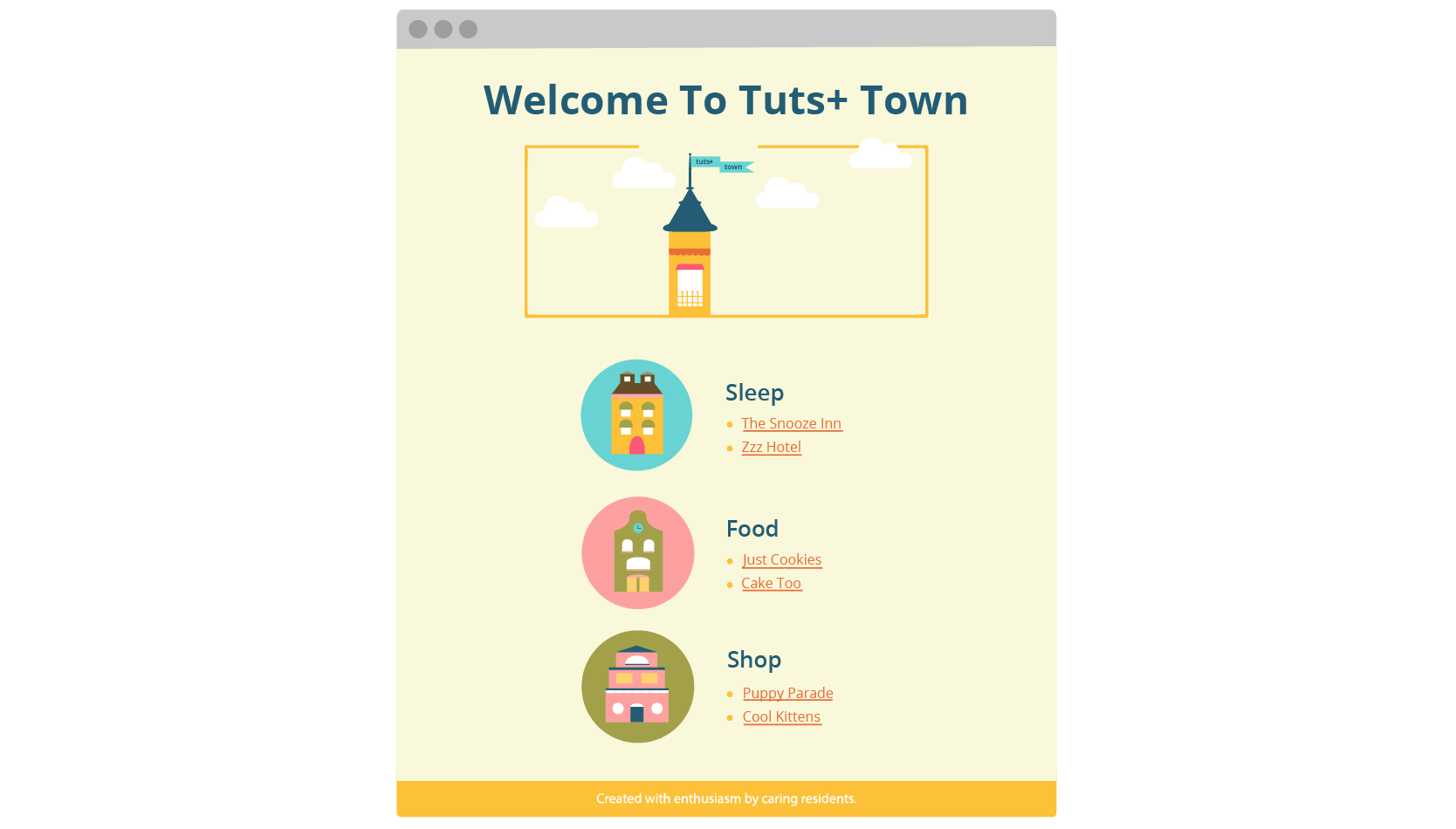
It’s also very common for a town to have a website, so the main task throughout the first part of the series is creating one for Tuts+ Town.
Some of the most useful resources I came across in preparing for Tuts+ Town were books, so I wanted to share which ones were my absolute favorite and touch on what makes them so special.
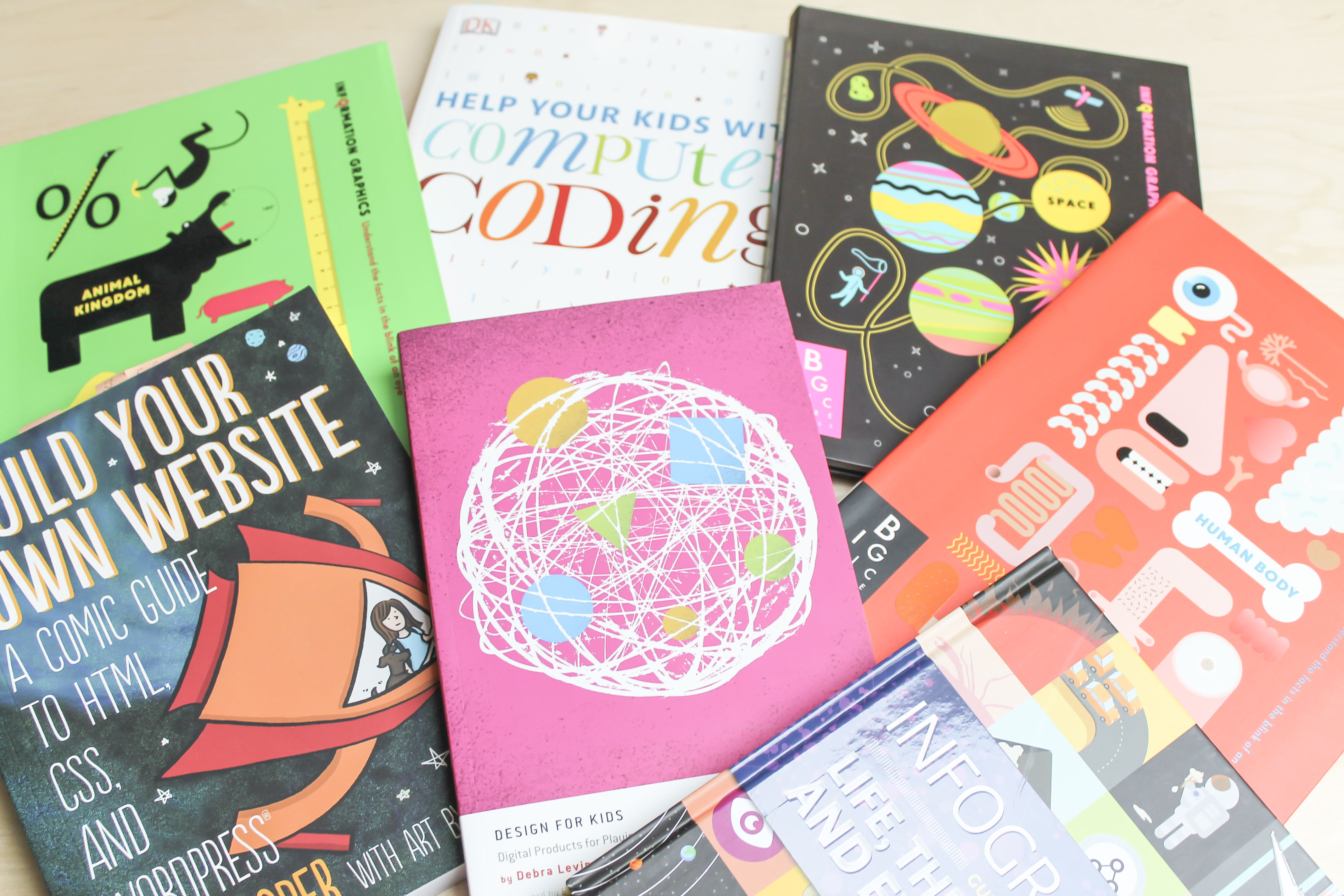
The very first book I picked up to prepare for this series was Design for Kids by Debra Levin Gelman. The best thing about this book is that it breaks up the information by age group, so I specifically focused on chapter 8, “Kids 10-12: Growing Up”.
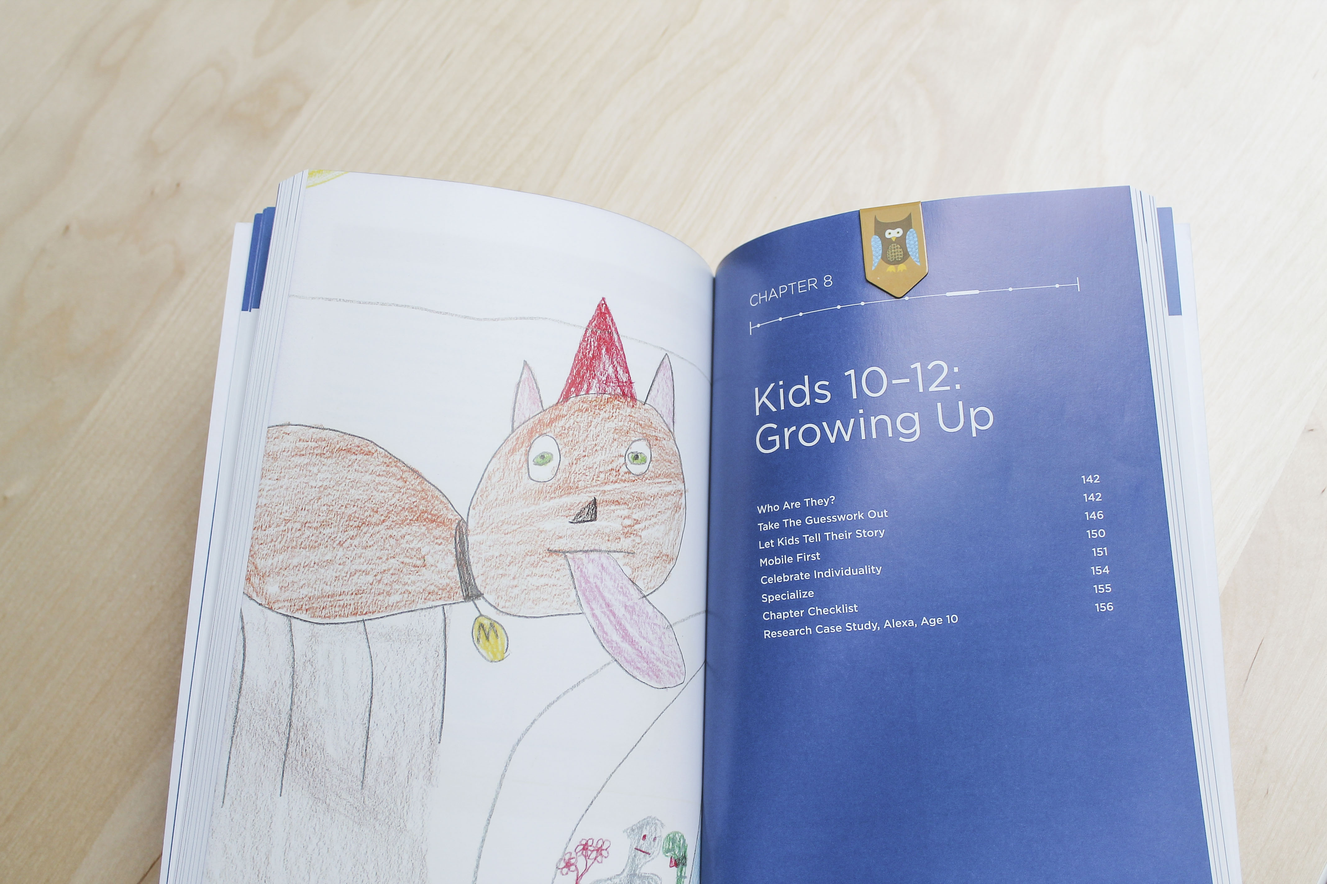
This book left me with a better understanding of what kids this age are capable of. The author does a splendid job of summarizing information in table form, outlining the characteristics of kids in each age group and how this relates to digital design for them.
I view this book as a bit of a cheat sheet to understanding kids and what it means in terms of design. The author has done a lot of research and shares it with the reader in a wonderfully organized, thoughtful way.
Build Your Own Website by Nate Cooper is an absolute must as a reference for communicating complex technical concepts in a highly visual way and I cannot recommend this one enough.
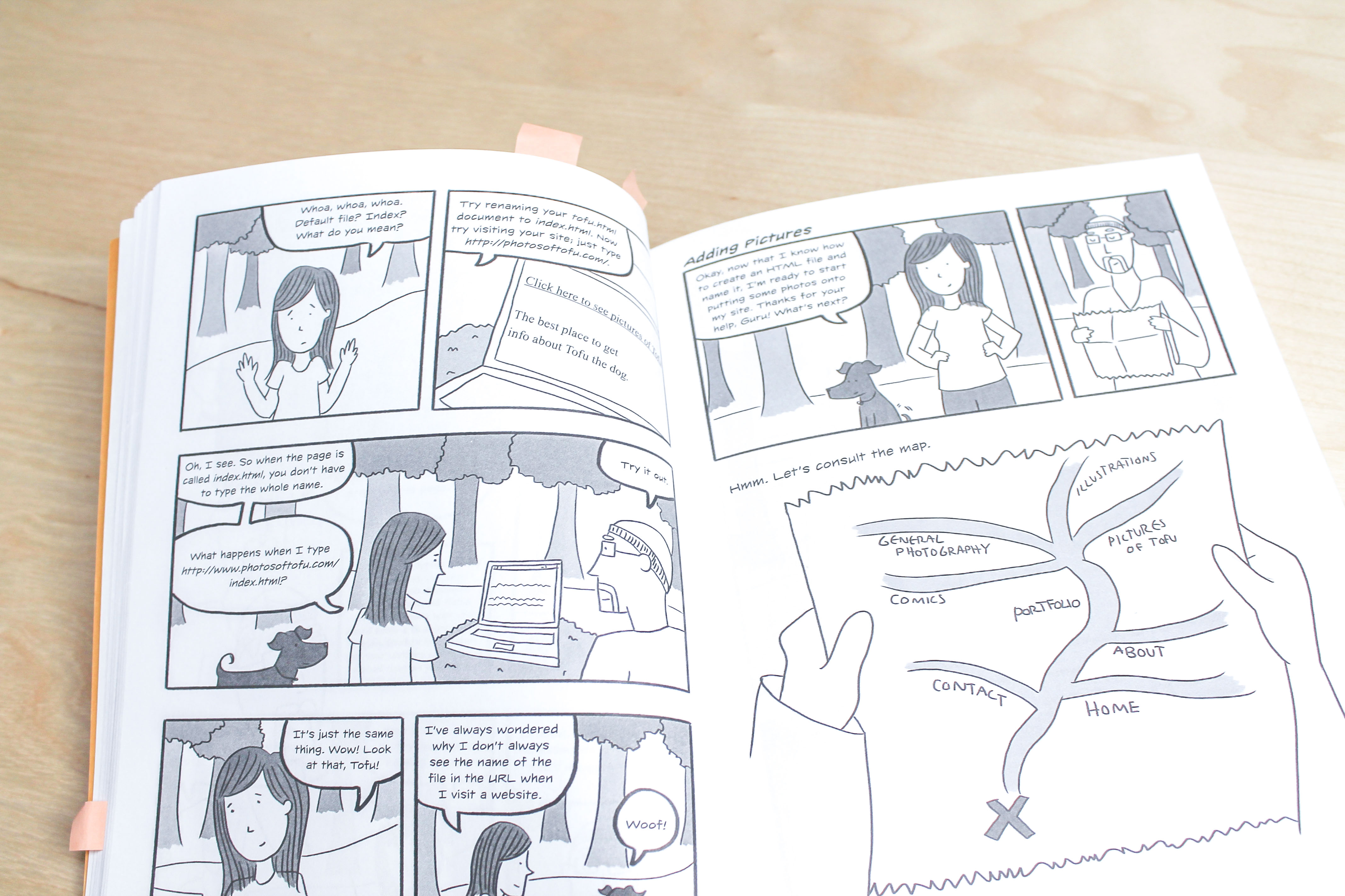
Cooper presents HTML and CSS in an incredibly easy to digest, fun way. The guide is in comic form and tells a neat story in addition to teaching the reader bunches about building a site.
Information Graphics is a beautiful series of infographics for kids on topics ranging from the human body to space to animals.
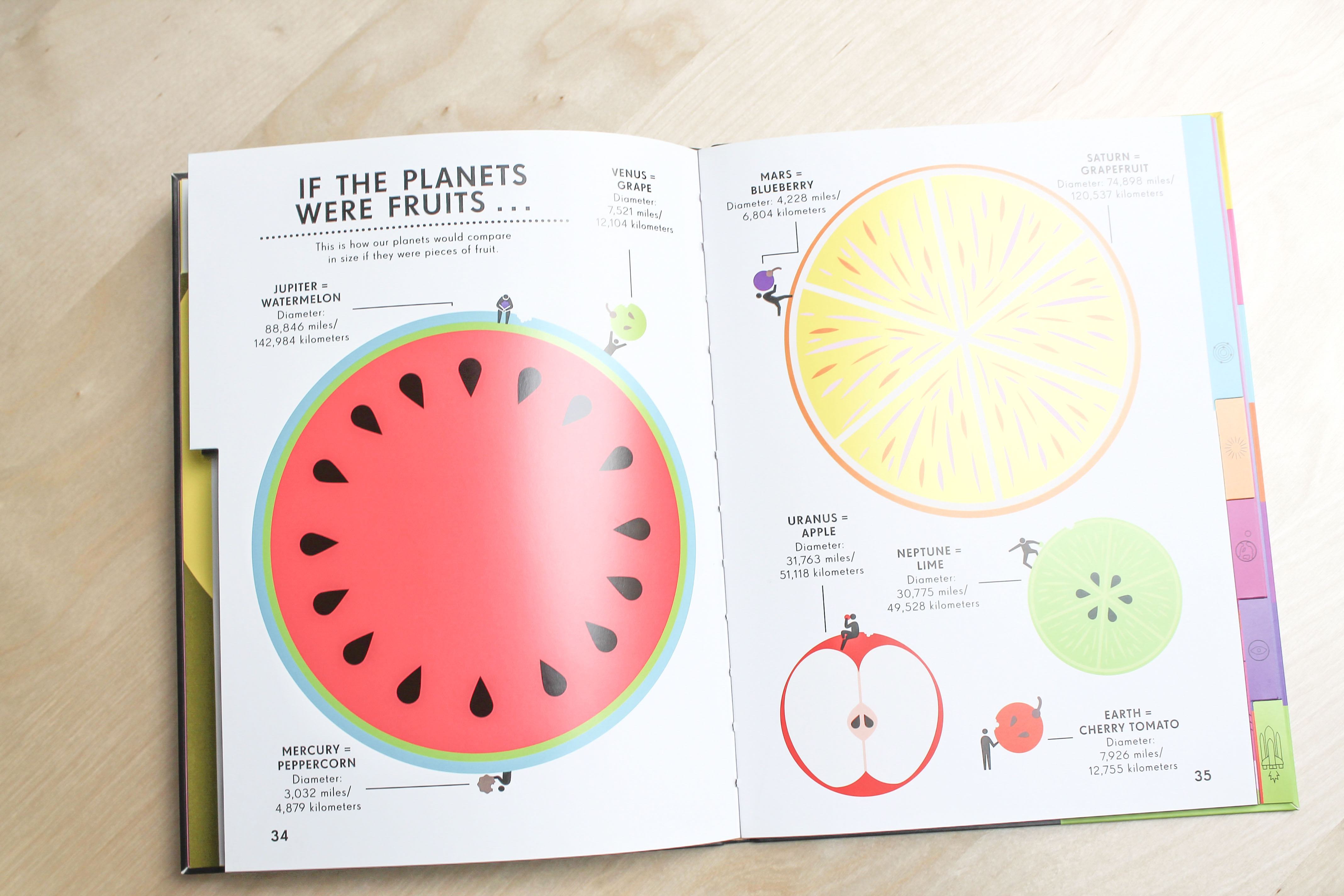
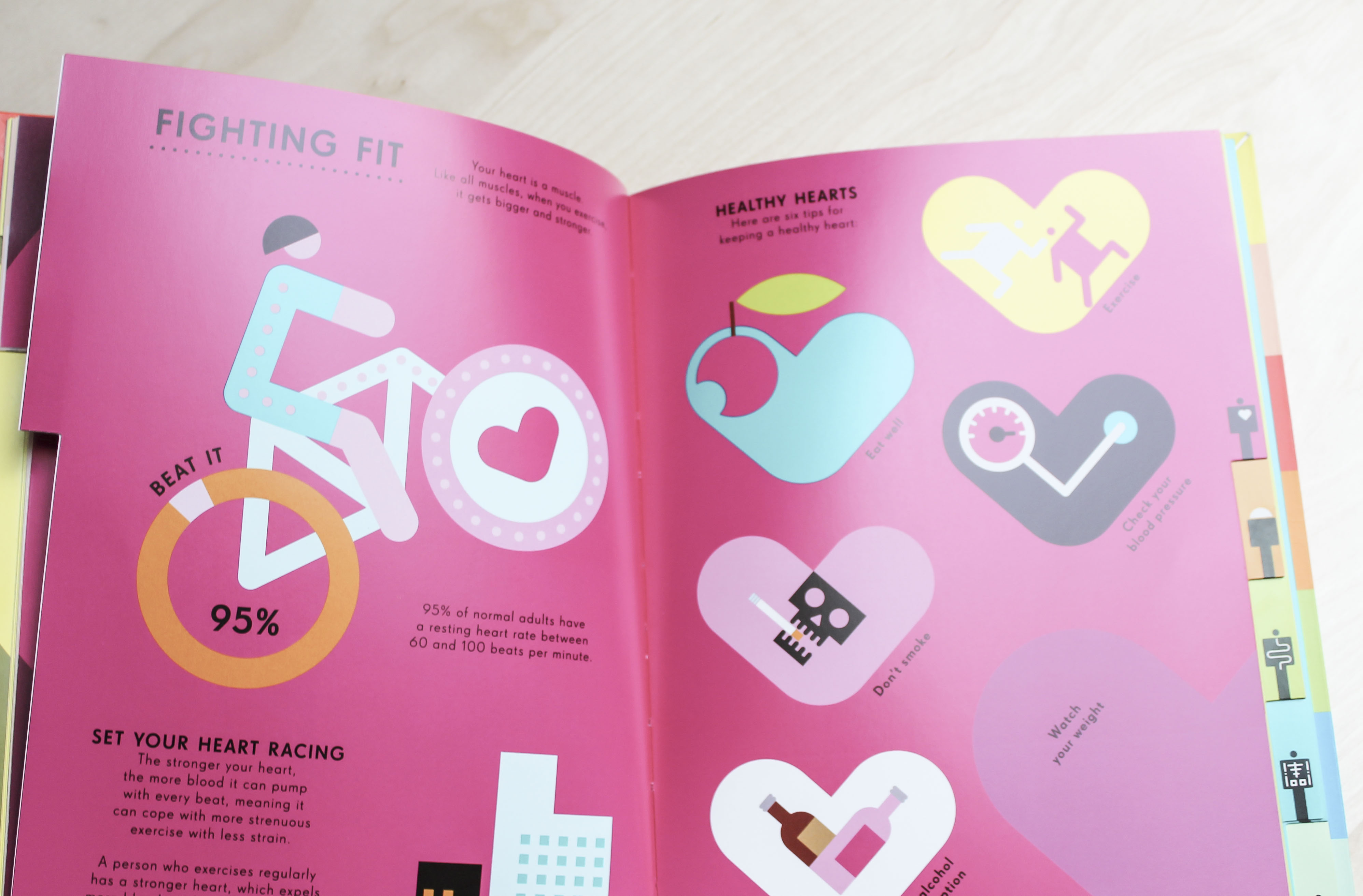
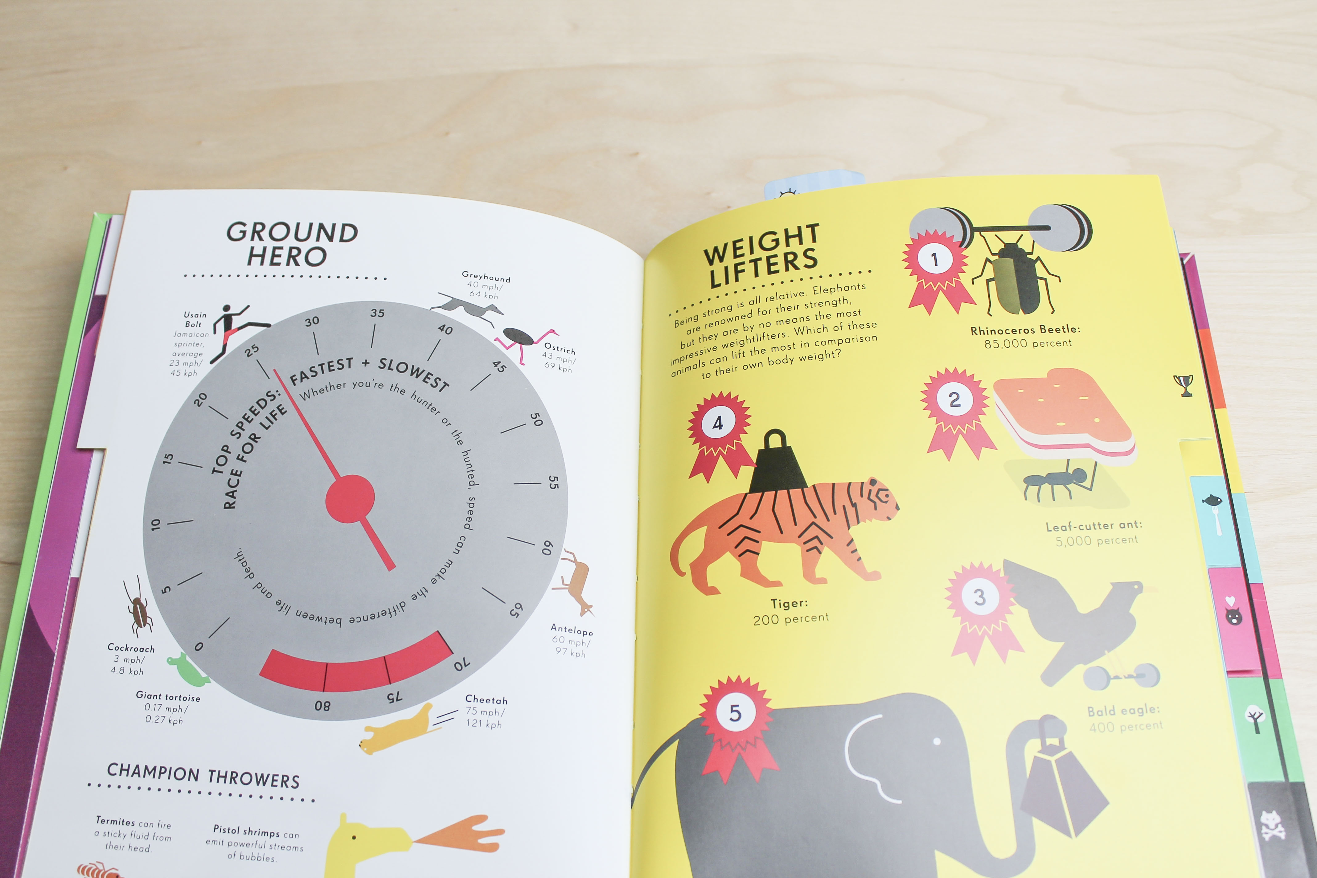
Seriously though, look at those images!
Concerning the 10-13 year old age group I found the Space book to be the most helpful. It takes fairly complicated facts, like how space is measured, and presents them in fun and interesting graphics.
Informative as well as a real pieces of art for all ages.
Help You Kids With Computer Coding from DK provides a beautiful breakdown of getting started with programming.
While my series doesn’t touch on programming, this book was super handy in getting a sense of how very basic graphics can be used to communicate complex technical concepts.
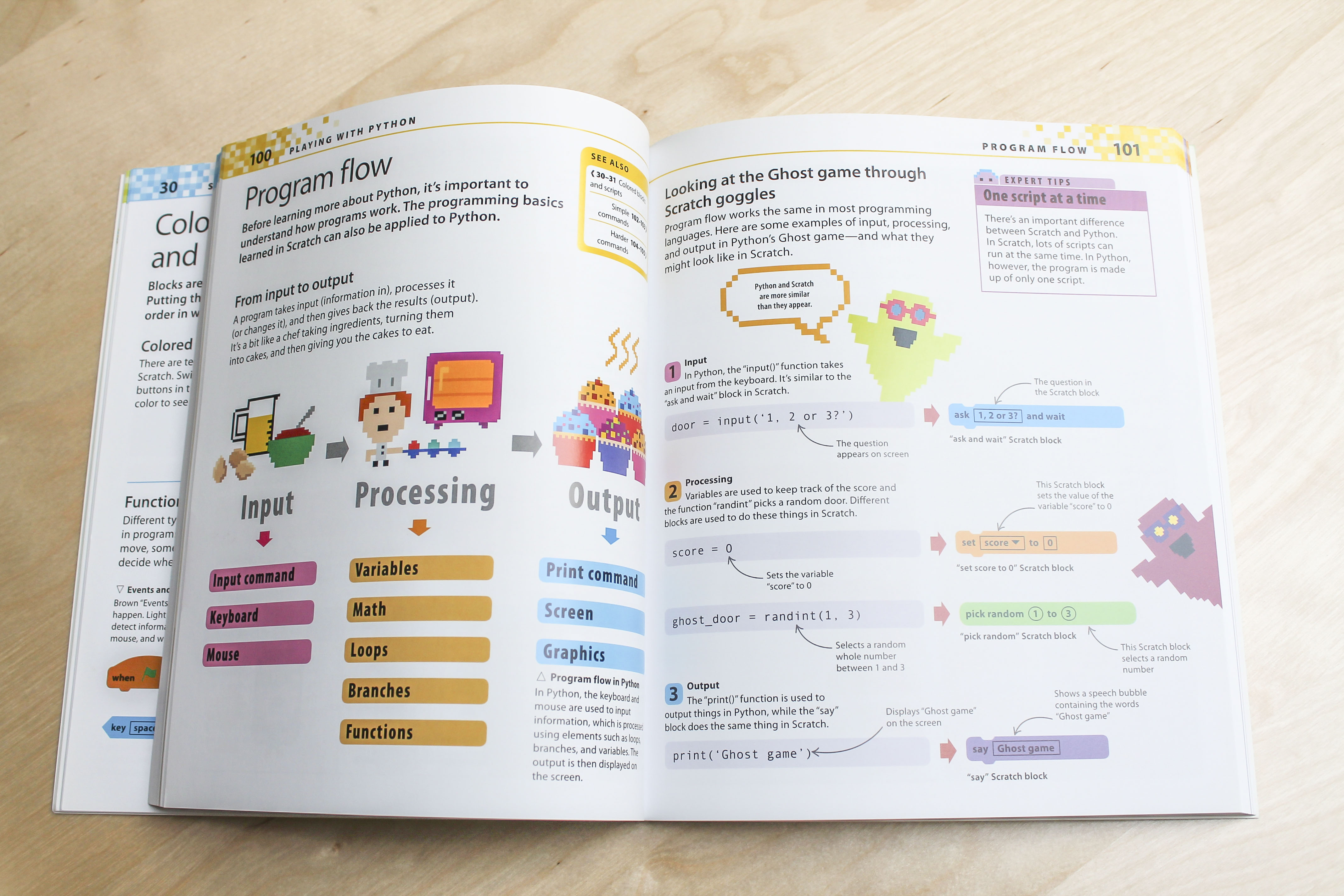
This book provides a supportive visual for everything, from communicating technical how-tos to describing the higher level concepts of programming (like comparing it to baking muffins in the image above!).
My main take away from this book though was how completely thorough the authors are. They give step by step instructions for everything, including how to install the necessary tools on your computer for all operating systems.
I learned a lot in developing and writing this series. One of the hardest parts of the entire project was eliminating all assumptions of existing knowledge. I couldn’t assume the audience already knew how files work or how the internet works, for example.
It’s easy to lose touch with the struggles of a beginner in general, but this becomes even more difficult when you factor in a much younger audience. So, perhaps the best advice I can give is to make no assumptions and eliminate all jargon.
Knowing all the right jargon is simply not necessary to get started with this stuff, so using it can often leave a reader frustrated and defeated.
Even having only been in web design a few years it was all too difficult to keep this in mind throughout all eleven tutorials; while some things can quickly become obvious as you get comfortable, nearly nothing is when first getting started.
PLUS, having a fantastic editor always helps, thanks Ian!

Tuts+ Town is by far one of my favorite projects so far, truly encompassing all my passions: teaching, illustration, design. It was also a total plesure working with Tuts+ for the first time.
As someone that got into web design much later in life, I can’t help but wish I had been exposed to resources like this series and some of the books listed here. Web design and coding should be accessible to all, and teaching kids how to get started in a fun and thorough way is a fantastic step towards ensuring this becomes reality.
Hopefully this little curated list of books and pieces of advice proves handy for others wanting to design digital content for kids but don’t know exactly where to start.
So, as we say in Tuts+ Town, “See you around town!”.