26 October 2016
I spent a lot of time over the past year and a half writing evaluations based on existing designs. I try to use each review as a teaching opportunity and am sure to take the experience of reading the review into account. I enjoy these; I’m proud of them and believe they speak to my high level thought process as a designer.
 s
s
A couple weeks ago I put out a tweet that I was available for part-time front-end design work and then received a few emails asking for links to my Dribbble or Behance profiles. I’ve also read enough job descriptions to know that we seem to ask for these regardless of what type of designer is being sought and I personally think this doesn’t make a whole lotta sense.
So much of being a designer, even a visual designer, is working on and producing things that are not necessarily “beautiful”. These notes and deliverables, the ones you don’t spend the day staging to share a screenshot of, are so telling in terms of process and thinking. After all, how can we possibly choose a designer without having a solid sense of how she solves problems or communicates?
Evaluations, sketchbooks, discovery reports, research notes and findings, interview questions, personas, CodePen demos, and napkin doodles are all alternative design artifacts one might produce that are not always appropriate to share via a cropped image. In order to get to the heart of what someone is capable of, what kind of problem solver they are, what their process is, or what kind of communicator she is we need to look beyond these obvious and uncontextualized mediums.
This post touches on my approach and structure of design evaluation reports, a process and deliverable that just doesn’t get enough love or attention. Hopefully this proves handy when preparing to tackle your own evaluation and helps speak a bit more to my process as professional designer™.
Having worked within a number of development focused shops the scenario is not an uncommon one: the client wants a pre-existing design built. Accepting this client is taking on a great deal of responsibility. It’s important to everyone involved that the site or product is a success (by measurable standards) and is something everyone involved is honored to have been a part of.
While an evaluation and discussion can often proactively resolve many of these potential worries it is not uncommon for a new discovery phase to be conducted if the designs are too far off base. This is where an initial usability eval can really come in handy to either resolve potential issues before they arise during implementation or shine light on the fact that perhaps the design isn’t quite salvageable and the project needs to take a few steps back to the discovery and research stages.
While this may sound like a lot of work already it is all less time consuming than figuring out these problems too late after hitting countless roadblocks in development.
In a perfect world this is where designers ask for any homework the company did to get to where they are now. This would include things like user research and personas, a list of measurable project goals, a clear vision, any design criteria and restrictions.
If these resources exist that’s fantastic and it will be a blast going through these before reviewing any mockups or existing product/site. However, this is usually not the case from my experience.
Luckily there are established usability heuristics we can follow regardless of whether or not we have these coveted strategy documents at our disposal. This list coupled with some general knowledge about common patterns will go a long way in feeling ready to take this on.
There’s actually some things consider in terms of the design and usability of the report itself and I’ll reference a report I completed earlier this year regarding a scheduling workflow for an LMS as an example going forward.
Again, this is a great teaching and healthy/constructive communication opportunity. We are telling stakeholders that *this* is what it is going to be like working with us.
As with everything, the audience needs to be kept in mind here. Stakeholders are often under a tremendous amount of pressure. They are often operating under painful timelines and budgets. This project could be a source of great tension within the organization. We are also likely reviewing a design that they spent bunches of money on and have high hopes for.
In order to make this document as useful and constructive as possible be sure to be mindful of language in speaking directly to potential concerns, organize it in a thoughtful way, and provide screenshots and suggestions for improvement.
It’s important to do everything possible to make sure these concerns and suggestions do not come across as overly negative, judgmental, or hostile.
Also be sure to have a handle on the accepted terminology for the project for consistency and avoid using design jargon without an explanation.
This type of document can easily become overwhelming and frustrating to review. If we were to present this as a seemingly endless bulleted list of problems it can quickly feel as if the situation is hopeless. How deflating.
Presenting each concern as its own section and then breaking that down into why it’s potentially problematic with a list of potential solutions can go a long way in successfully communicating problems but also ensuring they don’t become more discouraging than helpful and welcomed.
Speaking directly to why something is a concern is crucial. While it certainly helps speak to your thought process as a designer is also makes it more difficult to disregard.

Concerns should never feel as if they are personal opinions or that we simply don’t like the way something looks or feels. It’s our job to make sure this product or site is easy and enjoyable to use. If we see a faulty form that is not accessible or will be difficult to use we have to speak directly to why this is the case.
What a pain in the grass it would be to have to try and follow along with this document and have to keep toggling between it and the product/site/mockup for context. Including screenshots of which exact component is being referenced each step of the way will make this process much easier for everyone.
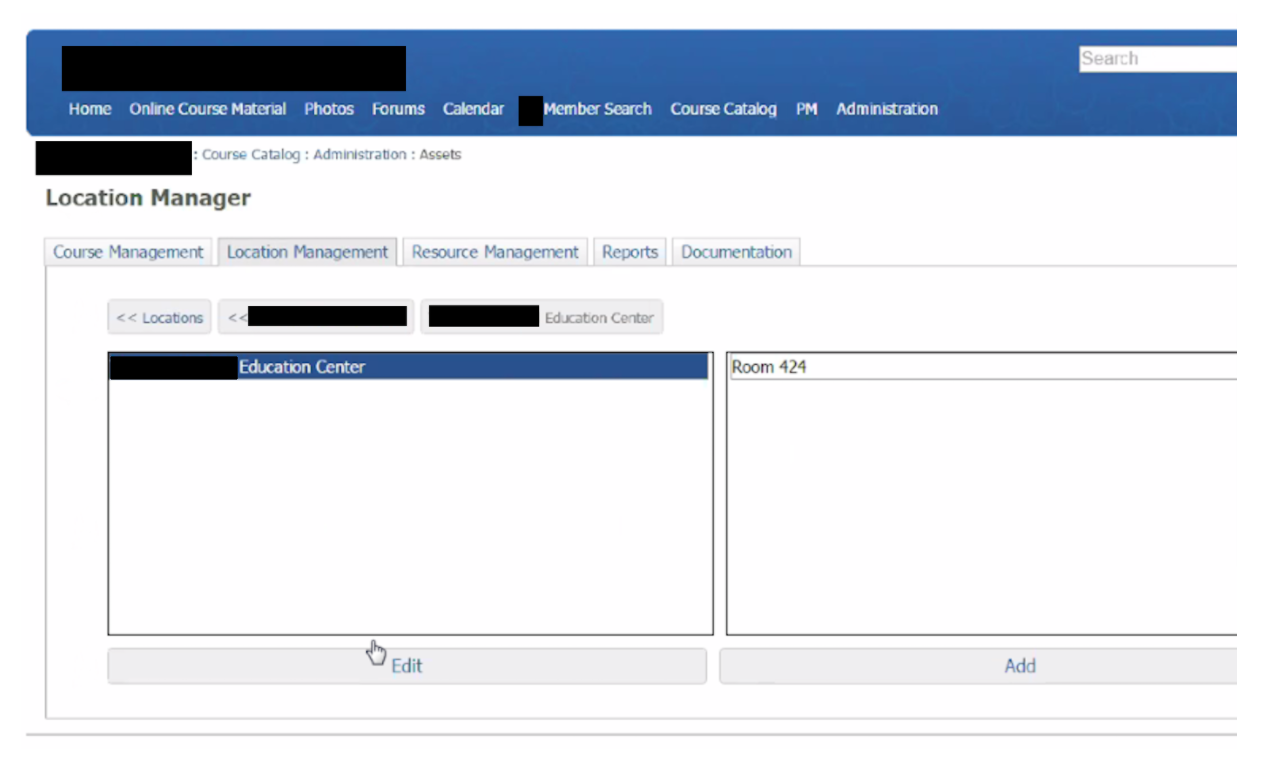
Screenshots are also crucial when mentioning possible solutions. This should’t be in the form of time intensive, high fidelity wireframes, however. What’s more appropriate at this stage are super low fidelity sketches (even on paper) or even screenshots or examples that already exist on the web. Providing these can do wonders in communicating suggestions and help the reader make comparisons.
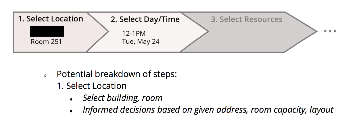
Suggestions are everything. Without them this report will feel like we are just complaining or even difficult to work with. This part makes it possible to keep the experience positive.
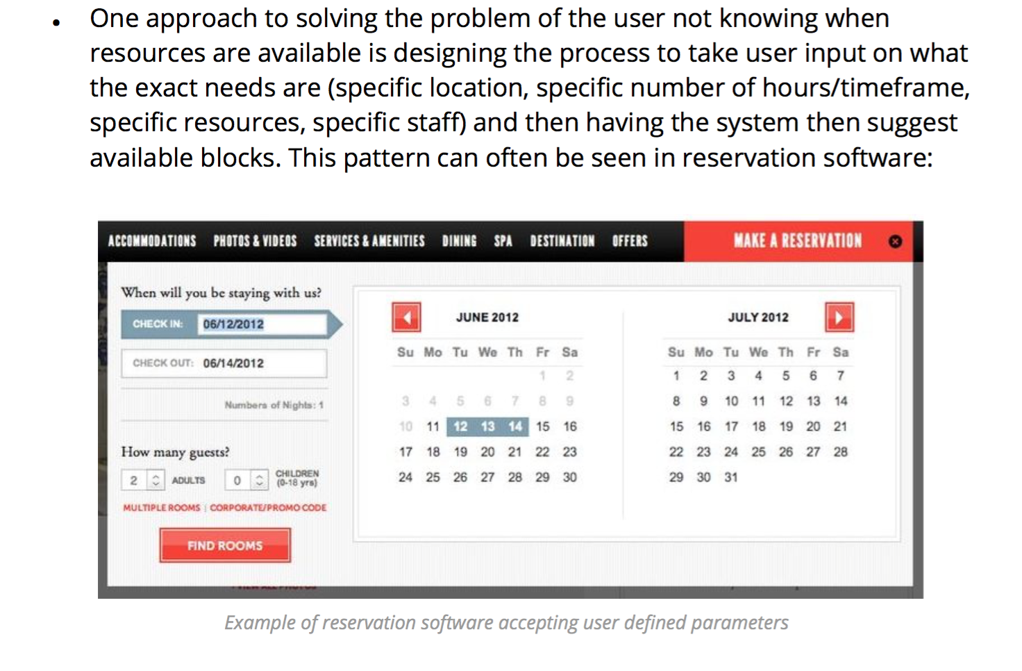
I try not to overthink this as it can quickly make this task seem larger than life. The most important part here to to show that these problems can be solved and that we’ve put some initial thought to high-level process and bits of UI. The project is not doomed. This is all totally doable.
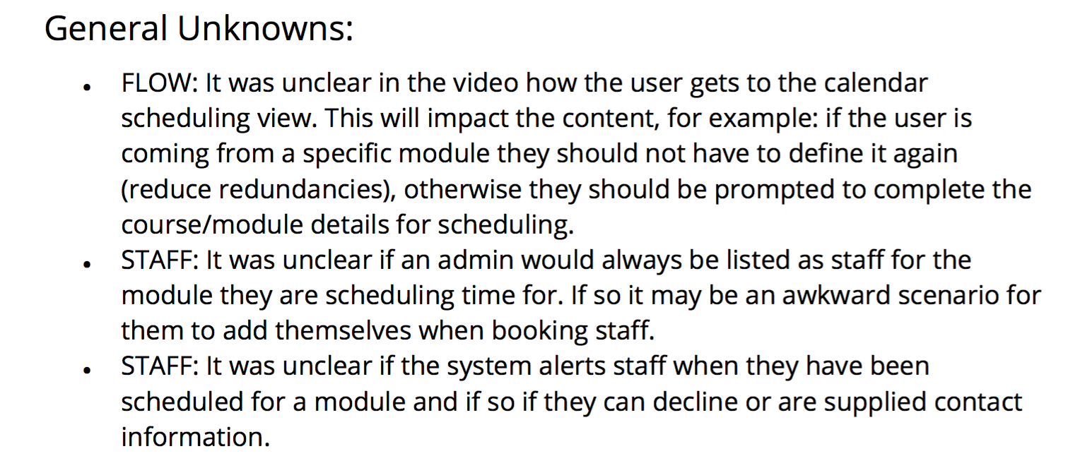
There will almost always be general unknowns and adding in a section that speaks directly to these can be thoughtful in that these may also be unknowns for users and could proactively solve problems before they arise later on.
This section is where I list out any context unknowns or what I see as potential non-ideal use cases; a great way to jot down any final thoughts, questions, or concerns that don’t fit neatly into a defined issue.
While there are countless mediums for sharing staged glimpses of work it just makes it far too easy to strip away context and limitations. It’s also a request that doesn’t make a lot of sense when looking for specific types of designers. Evaluations or design critique notes are just one way to gain insight into this often eliminated context.
As an employer try not to overlook these alternative items and as a designer don’t be afraid to show your notes, rough sketches, or even silly doodles.
Here’s the full PDF of the report referenced above, with especially telling product screenshots and names removed.