24 April 2017
CSS Grid has been getting a lot of attention recently and I finally dedicated time this past weekend to sit down and get a basic understanding of how it works. It was an emotional rollercoaster of an experience (seriously, this is life changing stuff) but I was able put together some notes while creating my demo and wanted to share.
This post is by no means a thorough look at just how powerful this layout feature is, but hopefully it helps take the potential intimidation factor out of the mix to get started, or spring into, CSS Grid.
Here’s a link to the full screen demo.
As with any new web thing I am trying to learn I instantly jumped into Adobe Illustrator 🙃 Feeling inspired by Earth Day, grids, and purple I set out to draw up a basic outdoor scene I could then work to replicate with CSS Grid and try to learn as I go.
Here’s what I ended up with:
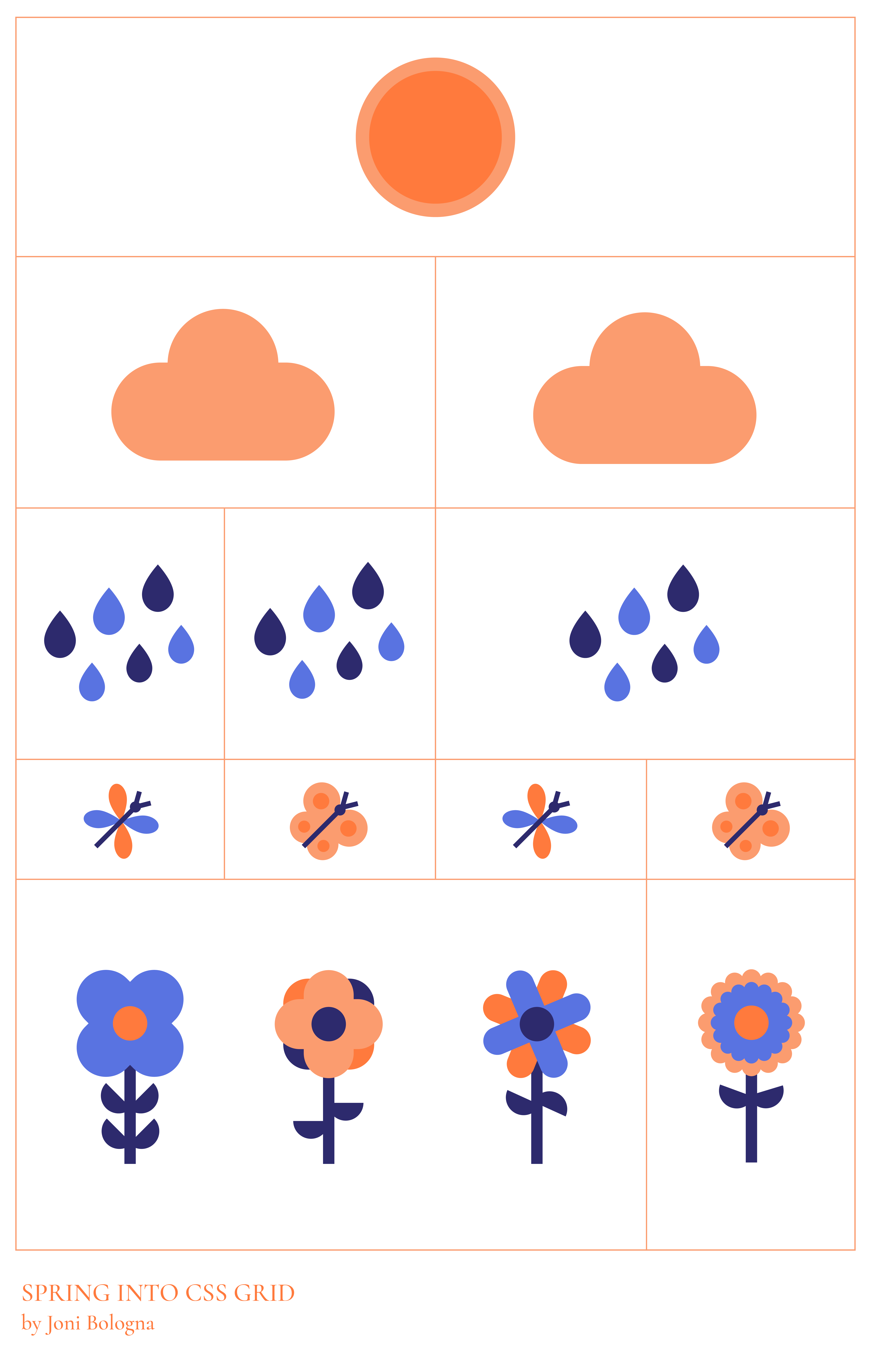
The markup consists of a primary container div with a clever class of contain with twelve direct child divs, each with a class of spring.
See the Pen Spring Into CSS Grid by Joni Trythall (@jonitrythall) on CodePen.
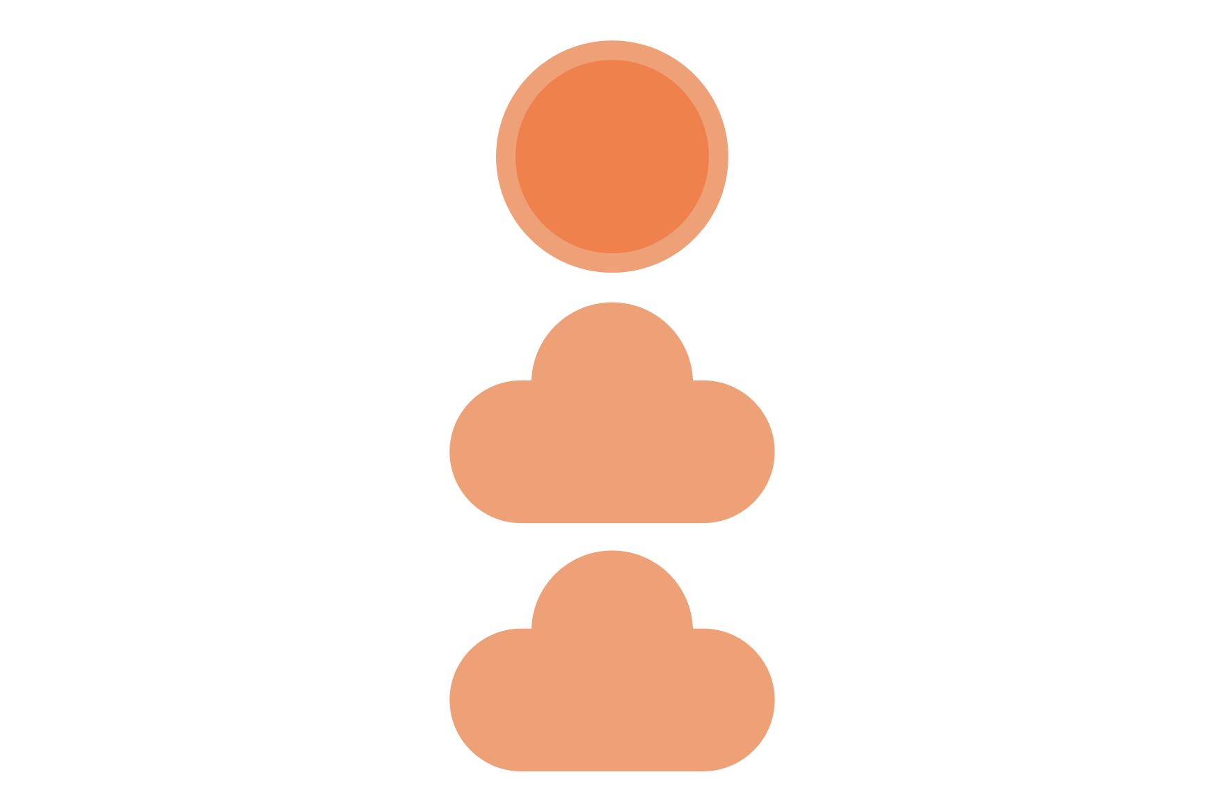
Before implementing Grid the layout is a standard block situation with all the images stacked on top of one another.
The first order of business when using a grid is to declare it so in CSS on the grid container:
.contain {
    display: grid;
}
Note: there are also inline-grid and subgrid as options here.
This will immediately set all the direct children within the container to grid items.
The initial grid is based on four equally sized columns which are set with the grid-template-columns property.
.contain {
    display: grid;
    grid-template-columns: repeat(4, 1fr);
}
The repeat function permits the shortening of 1fr 1fr 1fr 1fr.
Grid properties can accept a number of different unit values, for this demo fr is used exclusively. This unit is super clever and flexible as it divides available space into fractions, so 1fr 1fr 1fr 1fr results in four equally sized columns.
The grid gap is represented by the 2px orange spacing outlining each item. The gap reveals the background color of the main container, which is orange, and the outer line is a border on the body itself. Each grid item containing an image has a white background.
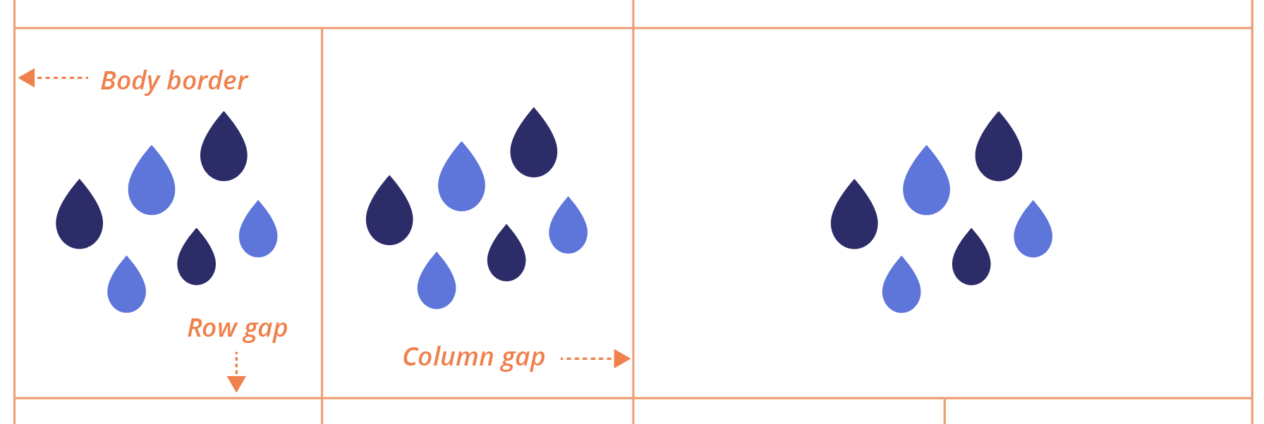
This demo applies a matching grid-column-gap and grid-row-gap by using the gap shorthand grid-gap. This property accepts either a single shared value or two different values, with the first for rows and the second for columns.
Once the base columns are set on the primary container each direct child div within the container can be further styled individually to achieve the following column grid:
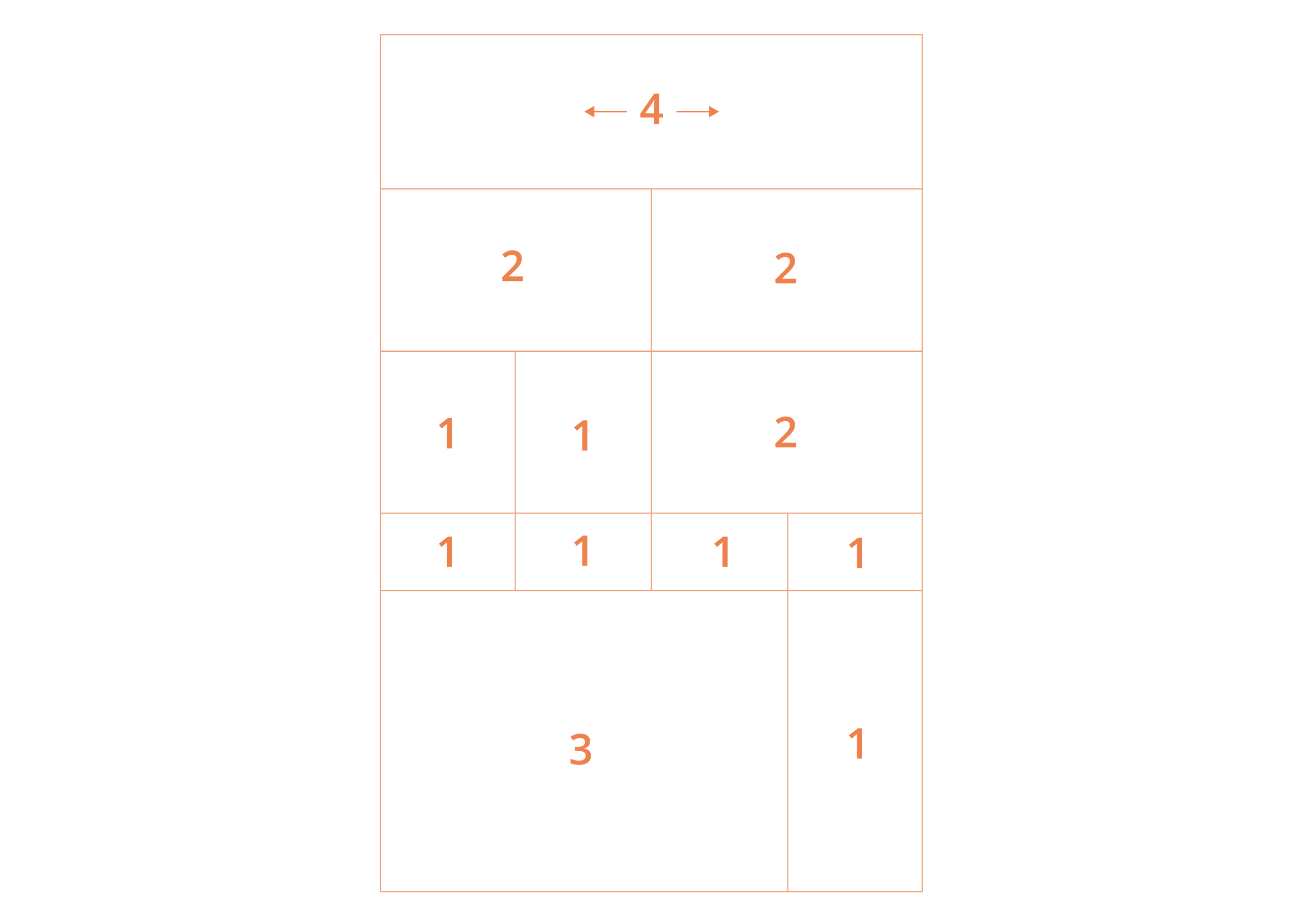
This is done by specifying start and end points for certain elements with the grid-column-start and grid-column-end properties, or grid-column as a shorthand.
The start and end points for each child div containing a rain image, for example, are defined as follows:
.spring:nth-child(4) {
  grid-column: 1 / 2;
}

.spring:nth-child(5) {
  grid-column: 2 / 3;
}

.spring:nth-child(6) {
  grid-column: 3 / 5;
}
grid-column: 1 / 2 ; on the fourth column item (the first rain image container) directs it to start at the first vertical grid line and end on the second, while the sixth item (the third cloud image container) is set to start at the third vertical grid line and end on the fifth, the end, making it twice as long as the others.

This can initially be a bit tricky, as the vertical line count exceeds the actual grid column cell count.
The sun is able to take up full width spacing by starting at the first vertical gird line and ending at the final line, the fifth line, spanning all four available cells.
.spring:nth-child(1) {
  grid-column: 1 / 5;
}

There was no need to do anything to the dragonfly and butterfly elements because the desired layout is consistent with the column declaration on the main .contain div.

Note: Grid items can actually overlap in grid cells, though it was not necessary for this scenario.
Circling back to the container element to set rows was one of the final steps I took to complete this weird scenery demo. While the initial columns consisted of equal spacing, the rows have more variation.
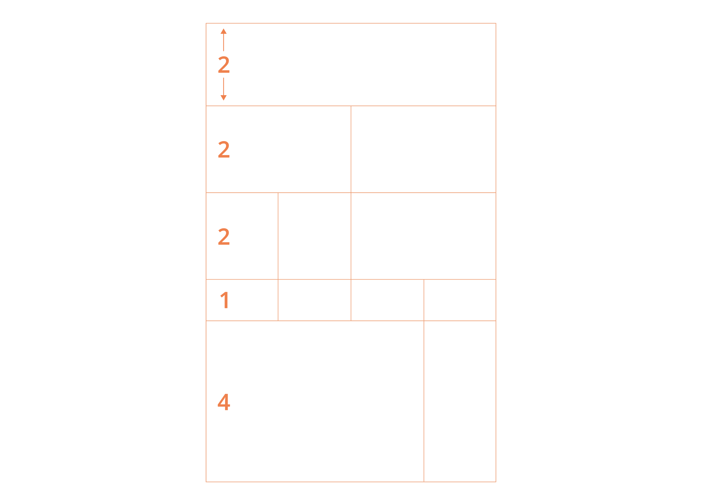
The first three rows are twice as tall as the smallest row while the largest, at the bottom, is four times the smallest: grid-template-rows: repeat(3, 2fr) 1fr 4fr;
The design was fairly light on row needs and this was the extent of row styling needed, but rows have their own set of properties and some can even be combined with column properties to create shorthands and keep CSS lookin’ 💅
Since I talk enough about flexbox (and recently created a printed visual guide to getting started) I’ll just say that flexbox is used in this demo to center the images within the grid items and that grid and flexbox do in fact work absolutely beautifully together.
Each image is centered within each item using:
.spring {
    display: flex;
    justify-content: center;
    align-items: center;
}
Within the div containing three separate flower images flexbox is also used to horizontally distribute them equally.

.spring:nth-child(11) {
    display: flex;
    justify-content: space-around;
}
Robin Rendle wrote a great summary about this majestic relationship recently over on CSS-Tricks.
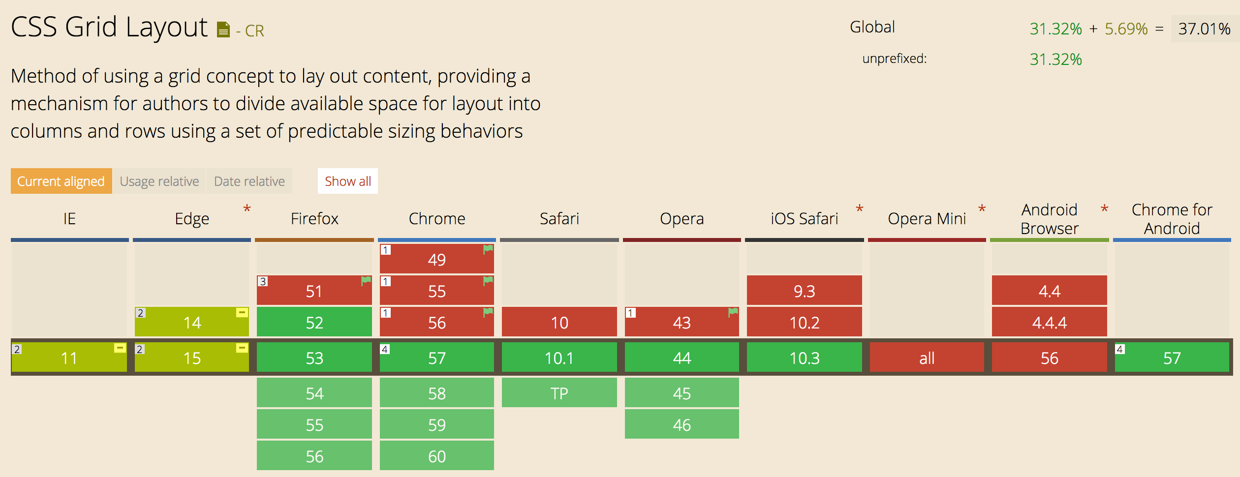
Current support looks a bit like this.
Here are some resources I found especially beneficial:
There is a lot more to learn when it comes to harnessing the power of CSS Grid and I can’t wait to write more, but hopefully this post serves as a fun starting point.