09 June 2014
I have been working with SVG gradients a lot lately. I wrote about getting started with SVG gradients over at SitePoint, and also an intro on animating SVG gradients over at Designmodo. While they are super neat and pretty straight forward, I ran into a couple cross browser issues that I wanted to discuss further in this post.
###spreadMethod
The very first cross browser issue I ran into relates to the use of the spreadMethod attribute. This attribute has three possible values: pad (default), reflect, and repeat. The values direct the gradient regarding how to fill in any remaining empty space, if the gradient is set to not cover the entire target (SVG shape or text).
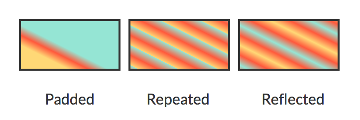
Let’s take a look at the following coordinates for a linear gradient: x1="20%" y1="30%" x2="0%" y2="50%". These coordinates will deliberately not cover the target area. If we fill three different rectangles with this gradient, and assign a different spreadMethod for each, each rectangle will fill differently.
Here’s a look at the different values in Chrome:

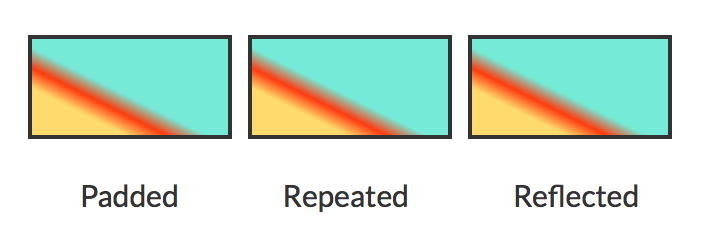
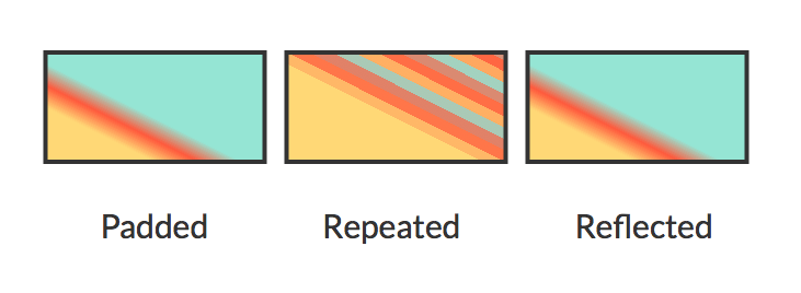
Any value other than the default (pad), however, does not render properly in Safari or Firefox:


The only work around here from my experience is to make sure your gradient fills the target, as it will do by default if your coordinates are left unspecified.
If your desired look is that of “pad” just set your coordinates to not fill the target. “pad” will take over by default and should render properly across browsers, as problems arise when using “repeat” and “reflect”.
###Animation Values
The second cross browser bump I hit relates to using <animate> within SVG gradients. If we set up the animate element within a stop with the intention of moving the gradient’s offset, we can only use numbers here, not percentages.
While you should technically be able to use percentages within these values, Chrome will not render the animation unless numbers are used. For example, the following animation will render successfully across browsers (except IE of course, which does not support SVG SMIL animation at all) because within values we are not using percentages:
<stop offset="100%" stop-color="lightblue" 					stop-opacity=".5">
        <animate attributeName="offset" 					       values=".95;.80;.60;.40;.20;0;.20;.40;.60;.80;.95" dur="14s" repeatCount="indefinite" />
</stop>
While it seems browser quirks (or “browser bummers” as I sometimes like to call them) are impossible to avoid, at least these ones have reasonable workarounds that shouldn’t alter your desired effect.
Happy cross browser gradient making!