01 July 2014
Using SVG inline provides total access to the graphic for complete customization and control over its output. This is especially handy when creating shapes by hand in the browser, or making edits to an existing graphic.
There are a number of stroke related attributes within SVG that allow us to control the details of our strokes, just as we do in vector graphic software.
Hopefully this quick post will serve as a general guide to getting started with these attributes and contribute to understanding their capabilities and potential. This can especially be handy when you start animating them, for example.
To demonstrate the effects of these different attributes we will be taking a look at an image of some grapes.
###stroke
The stroke attribute defines the “border” color of particular shapes and paths.
See the Pen 1 by Joni Trythall (@jonitrythall) on CodePen.
The default value for this attribute is "none".
###stroke-width
The stroke-width value establishes the width of our grape’s border, which is set to 6px.
The default value for this attribute is 1. If a percentage value is used the value is based on the dimensions of the viewport.
###stroke-linecap
stroke-linecap defines which shape the end of an open path will take and there are four value options: butt, round, square, inherit.
Here’s a look at the details of each option:
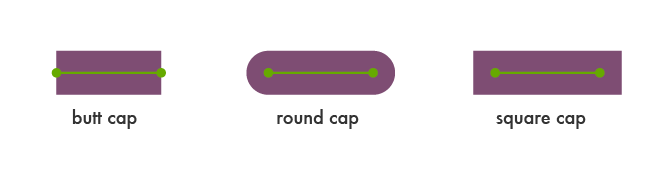
Let’s set this attribute value to square for the stem of our grapes.
See the Pen 2 by Joni Trythall (@jonitrythall) on CodePen.
###stroke-linejoin
stroke-linejoin defines how the corners of strokes will look on paths and basic shapes.
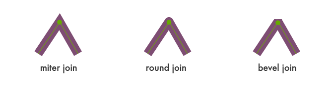
Here’s what happens when we change the linejoin of the corner of the grapes from round to bevel:
See the Pen 3 by Joni Trythall (@jonitrythall) on CodePen.
###stroke-miterlimit
When two lines meet at a sharp angle and are set to a stroke-linejoin="miter", the stroke-miterlimit attribute allows for the specification of how far this joint/corner extends.
The length of this joint is called the miter length, and it is measured from the inner corner of the line join to the outer tip of the join.
This value is a limit on the ratio of the miter length to the stroke-width.
1.0 is the smallest possible value for this attribute.
The first grape image is set to stroke-miterlimit="1.0", which creates a bevel effect. The stroke-miterlimit on the second image is set to 4.0.
See the Pen 4 by Joni Trythall (@jonitrythall) on CodePen.
###stroke-dasharray
The stroke-dasharray attribute allows us to turn paths into dashes rather than solid lines.
Within this attribute you can specify the length of the dash as well as the distance between the dashes, separated with commas or whitespace.
If an odd number of values are provided, the list is then repeated to produce an even number of values. For example, 8,6,4 becomes 8,6,4,8,6,4 as shown in the second grapes image below.
Placing just one number within this value results in a space between the dashes that is equal to the length of a dash.
See the Pen 5 by Joni Trythall (@jonitrythall) on CodePen.
The first grapes image here shows the impact that a list of values has on the path.
###stroke-dashoffset
stroke-dashoffset specifies the distance into the dash pattern to start the dash.
See the Pen 6 by Joni Trythall (@jonitrythall) on CodePen.
In the example above, we have a dash set to be 40px long, and a dashoffset of 35px. At the starting point of the path the dash will not become visible until 35px in to the first 40px dash, which is why the first dash appears significantly shorter.
###stroke-opacity
The stroke-opacity attribute is pretty straightforward and allows us to set a transparency level on strokes.
The value here is a decimal number between 0 and 1, with 0 being completely transparent.
###stroke @keyframes Animation
stroke attributes can be animated. This can produce some especially unique effects when, for example, you animate a path’s stroke-dashoffset.
To make the path of the first grape image below appear “drawn in” a stroke-dasharray has been set to a dash length that covers the entire path. We then can set a matching stroke-dashoffset that is also long enough to cover the path, making it essentially disappear for the time being.
Through @keyframes draw the stroke-dashoffset is set back to “0” at the 50% point, making it appear as if it is drawing and un-drawing itself.
See the Pen 7 by Joni Trythall (@jonitrythall) on CodePen.
With the second grapes image there is a stroke-dasharray of 70px, and through @keyframes shift we are animating the stroke-dashoffset to 200px at the 50% point.
###Conclusion
Inline SVG provides us with very powerful editing options. If we want to make changes to an SVG we have created outside of the browser, SVG provides us with the tools to make these edits via certain attributes.
In this post we have reviewed the basics of SVG stroke attributes to explore their general purpose and in-browser editing capabilities.